Corliss King Can
A campaign identity rooted in community trust and civic presence. Built to stand clearly across print, digital, and neighborhood level touchpoints.
GoalStar Athlete
A dynamic identity for a next generation athlete development platform. Built for performance, ambition, and the young athletes it serves.
Satin Seedie
A soft luxury brand identity that blends botanical warmth with clean editorial confidence. Designed for a premium wellness and lifestyle audience.
The Tabyl
A brand built at the intersection of spiritual expression and cultural identity. Layered, evocative, and made to be felt as much as seen.
NCR Strategies
A refined identity system for a consultancy that operates where infrastructure meets influence. Authority and clarity in equal measure.
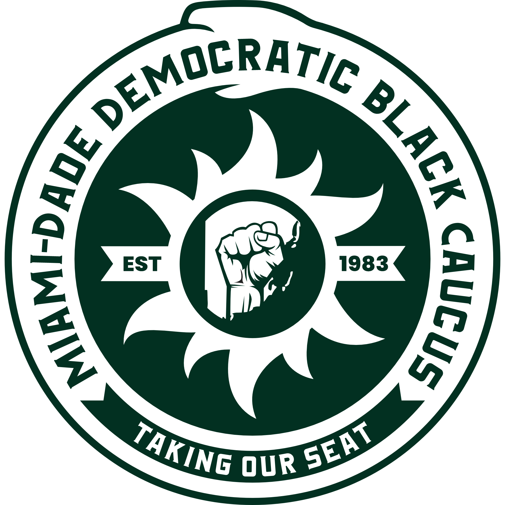
Miami-Dade Democratic Black Caucus
A complete brand architecture for one of Florida's most consequential civic organizations. Symbol, palette, typography, and voice, built to unify and endure.
Handlr
A clean, authoritative identity for a political strategist built around precision, clarity, and forward movement. Designed to communicate control without rigidity.
Paint Masters Ohio
A bold, trade confident identity for a professional painting company rooted in Ohio craftsmanship. Built to own the local market visually.
J Shot It
A sharp, camera forward identity for a photography brand that works across events, portraits, and commercial shoots. Built for a creative who shows up ready.
Eye Management Group
A bold, premium identity for a talent and management group operating at the intersection of entertainment, business, and influence.
Faith-Based Basketball Association
A full color badge identity for a basketball association built on faith, community, and competition. Where court culture meets spiritual purpose.
Just Jack
A personality driven wordmark for a cannabis lifestyle brand built around culture, craft, and character. Equal parts approachable and intentional.
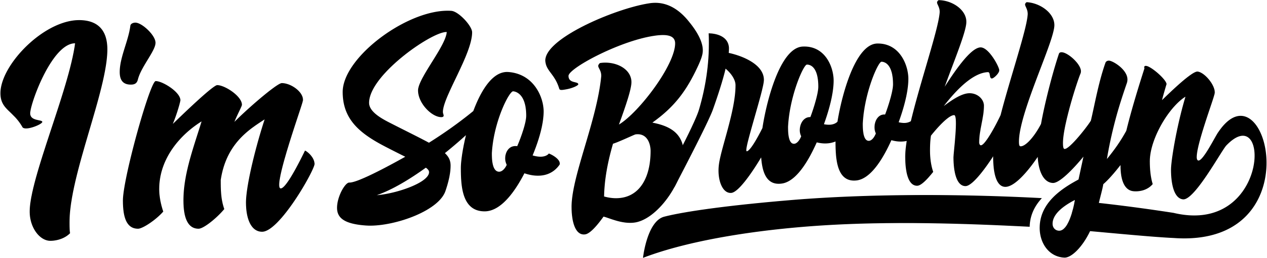
Kool For Life
Three distinct logos for a culture rooted apparel brand spanning Brooklyn identity, New York pride, and a clean brand wordmark. Built to flex across product lines without losing coherence.
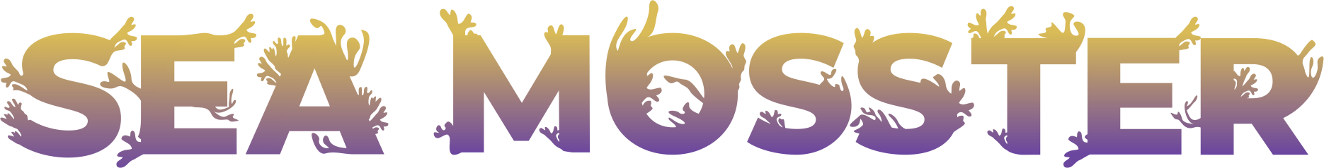
Sea Mosster
A gradient forward wordmark for a sea moss brand that blends natural wellness with bold visual personality. Built to stand out in a crowded market.
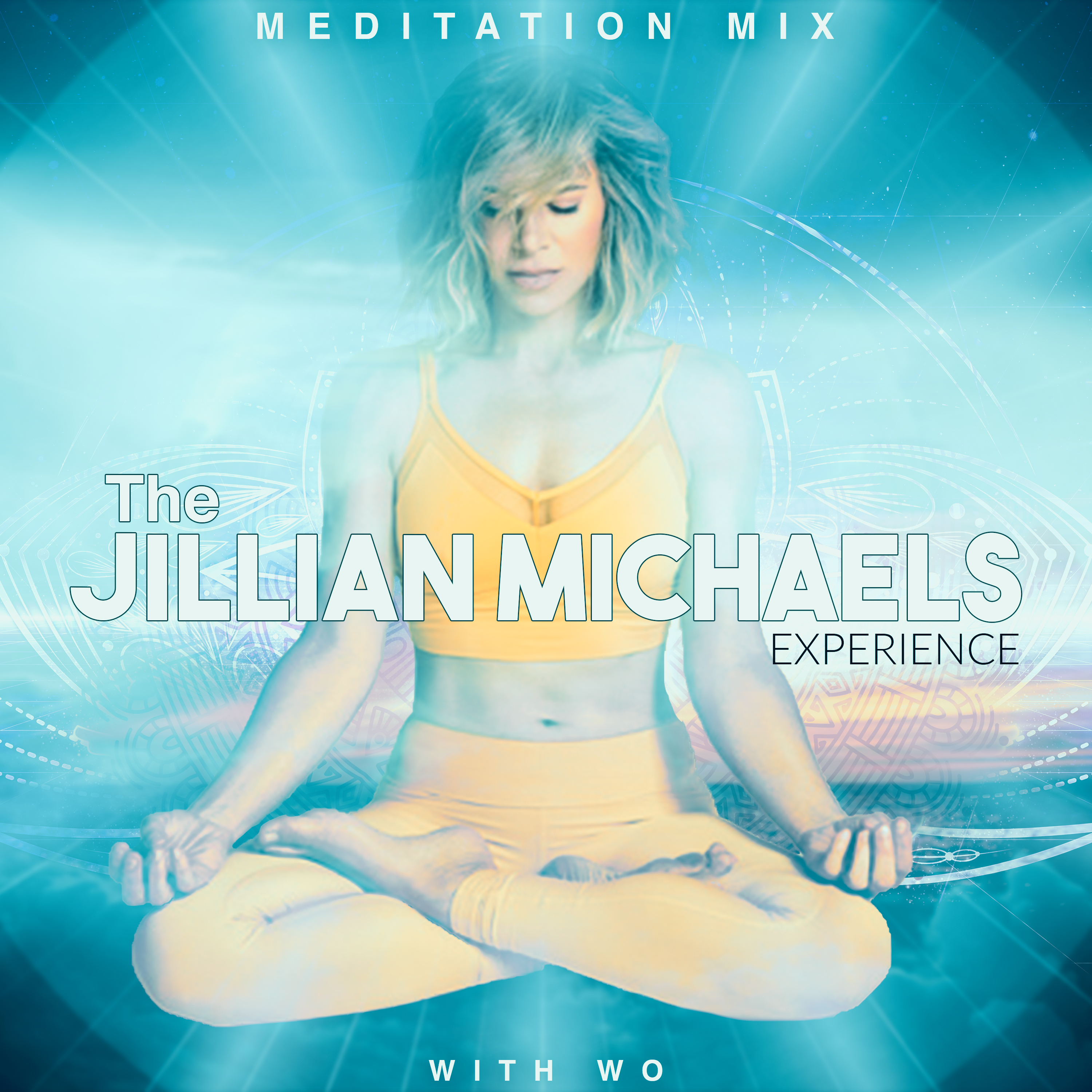
The Jillian Michaels Experience
An album artwork mockup created in response to Jillian Michaels inviting a collaboration on a meditation project. A visual proposal showing how the project could look and feel before any formal commitment.

Artist Digital Promo
A promotional photo composite for a music artist. The photoshoot was conducted on location, then the background was fully rebuilt into a neon tech environment in post.
Graphics as Strategy Made Visible
Dzeyen House approaches graphics the same way it approaches systems: structure first, then expression. Each identity is built to communicate clearly, carry meaning, and support the work it represents.
A mark that cannot hold up under real conditions is decoration, not design. Every project begins with understanding what the organization needs to communicate, then building a visual system precise enough to do that work consistently.
Rooted in Purpose
Every visual decision traces back to the organization's mission, audience, and context. Nothing is arbitrary.
Built to Hold
Identities designed to perform across formats, from digital to print to physical environments, without losing clarity or authority.
Easy to Extend
Systems, not one-offs. Each identity is structured so it can grow with the organization over time.